Given its scale and significance, I will present my analysis of this project in several installments. These are the ten design proposals shortlisted for the next series of euro banknotes. At this moment, they are under the gaze of millions. Citizens of the euro area have been invited to choose their favorites in a survey that will remain open until September 21. The Governing Council will select one of them at the end of the year. I suspect it will not be the proposal that receives the most votes. Popular approval guarantees nothing. If time proves the selection to have been a blunder, those consulted will be the ones left to pick up the pieces.
Once again, a banknote exceeds its function as an instrument of payment. It also constructs an image of Europe. For the next series, Europeans have chosen two themes through which they wish to recognize themselves and present themselves to the rest of the world. They are their culture—as one might expect—and, curiously, their natural world. More specifically, their rivers and birds. Christine Lagarde, President of the ECB, stated that the new banknotes would become one of Europe’s most tangible expressions and that, through a combination of aesthetic excellence and meaning, they would reinforce a shared identity.
The shortlisted proposals emerged from a call launched by the ECB on July 25, 2025, specifically addressed to professionals residing in the European Union. The application platform remained open until August 18, 2025. This initial phase was devoted to receiving submissions. From it came the 25 designers invited to develop their proposals in full. The second phase began in November 2025, when they received a detailed briefing outlining what was expected of them. The final versions arrived progressively until the deadline on April 24, 2026.
An independent jury of 21 experts from different fields—graphic design, communication, neuroscience, and history, among others—then selected the ten finalists. Each expert had been appointed by a central bank within the euro area.
Alongside the public vote, an independent research company will conduct another survey using the same questions among a representative sample of euro-area citizens. Less extensive, I imagine, and perhaps governed by more grounded criteria. The ECB will publish a report containing the results of both surveys once the final design concept has been selected. In reaching its decision, it will consider the jury’s conclusions, a technical assessment, and the results of both consultations.
The chosen series will undergo an additional process of development and testing before production. The new banknotes will enter circulation over the coming years. The current series will continue to circulate alongside them. This will be the first comprehensive redesign of euro banknotes since their introduction in 2002.
The new banknotes will incorporate the latest technological advances to stay ahead of counterfeiters. They will also include additional security features that make authentication easier and improve accessibility, particularly for people with visual impairments. The ECB also intends to reduce the environmental footprint of banknotes by increasing their durability and using more sustainable materials and production processes.
Let us turn to the proposals. With whatever degree of authority each reader cares to grant me, here are my comments and the scores I would give them.
Proposal by Jan Robert Dünnweller
Proposal by Jan Robert Dünnweller
Dünnweller is a German illustrator and graphic designer born in Cologne in 1984. Educated in Linz, Istanbul, and Weimar, his work moves between the rigor of design and the associative freedom of illustration. He regularly collaborates with publications as distinguished as The New Yorker, The New York Times, Die Zeit, The Atlantic, and Der Spiegel. He has developed a visual language of clean lines and studied simplicity, capable of condensing complex ideas into clear and ingenious images.
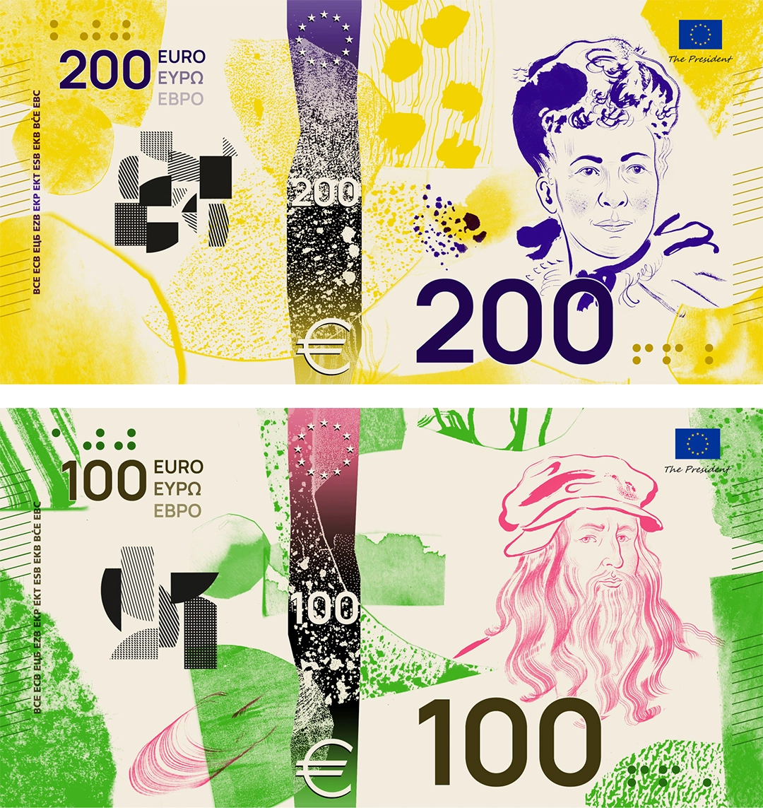
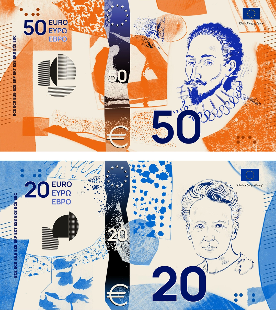
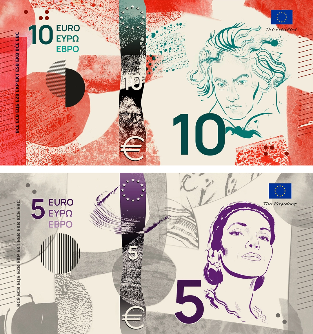
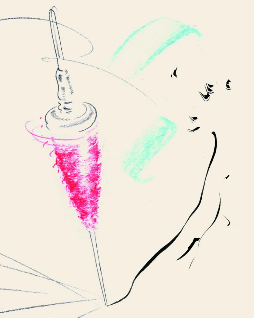
Dünnweller conceives his series through collage. The elements appear scattered at first glance, yet they occupy spaces entirely governed by a visual and informational structure. Many of the illustrations remain deliberately open, their contours never fully closed. Formally, the proposal’s strength—and its weakness—lies in its almost chaotic mixture of registers. Linear portraits coexist with irregular textured marks, geometric patterns, and flat areas of color.
Proposal by Jan Robert Dünnweller
Institutional symbols overlap with barely sketched human scenes. The portraits are rendered with a clean, calligraphic, almost editorial line. He replaces the classical volume of banknote engraving with a more contemporary solution. The denomination operates as a graphic element with a certain autonomy, forceful and immediately recognizable.
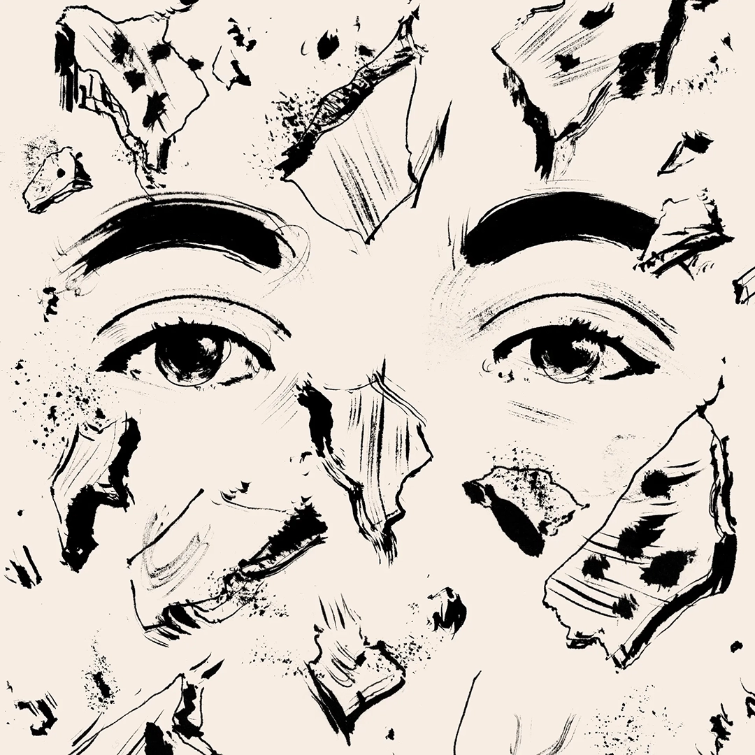
The supporting graphic language introduces rough-looking textures—granulated marks, dry brushstrokes, dragged areas, and surfaces reminiscent of artisanal printing processes. These textures form one of the proposal’s visual foundations and prevent it from acquiring an excessively digital coldness. It may be seeking to seduce through naturalness and informality.
Proposal by Jan Robert Dünnweller
The absence of dominant visual references allows the signifying layers to coexist without fully merging. Such fragmentation would make sense if the intention is to present Europe as an overlay of traditions, languages, and experiences, irreducible to a homogeneous identity. The approach would be conceptually sound, although less convincing in visual terms.
The numerals have a forceful presence. They function as a fragile visual anchor against a rather anarchic background. On the obverse, they interfere with the portrait, something that does not occur on the reverse with the collective scenes.
Proposal by Jan Robert Dünnweller
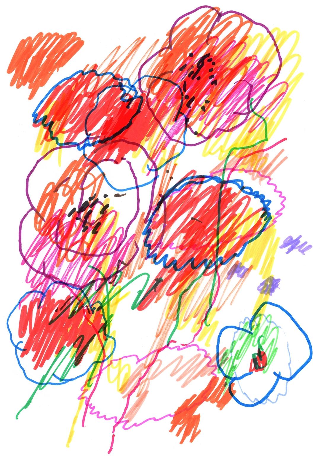
It is precisely on the reverse that the visual language changes scale. The monumentality of the individual figure disappears, giving way to social scenes: people walking, gathering, playing music, occupying squares or shared spaces. The figuration is rapid, silhouetted, and close to the immediacy of a sketch. In this way, the emphasis shifts from the historical individual to culture as a collective practice. Culture appears embodied in bodies, gestures, and encounters, while remaining a form of inheritance.
Proposal by Jan Robert Dünnweller
I will leave color outside this analysis because almost all the proposals rely on chromatic differentiation. Some are more strident than others, brighter or more subdued. Such differentiation is useful when it helps distinguish denominations, although it can become problematic when it alters the emotional character of each banknote too drastically.
The proposal has an identity of its own. It distances itself from the European banknote we already know. Its commitment to texture and hand-drawn imagery brings it closer to the language of the poster, the artist’s notebook, and contemporary cultural graphics. The risk lies there as well. At times, the accumulation of elements may compete with the functional clarity a banknote demands. The effectiveness of the whole will depend on the precision with which it reconciles expressiveness and legibility.
Proposal by Jan Robert Dünnweller
For anyone who may be interested, my score would be 7.6 out of 10.











Comments powered by Talkyard.