
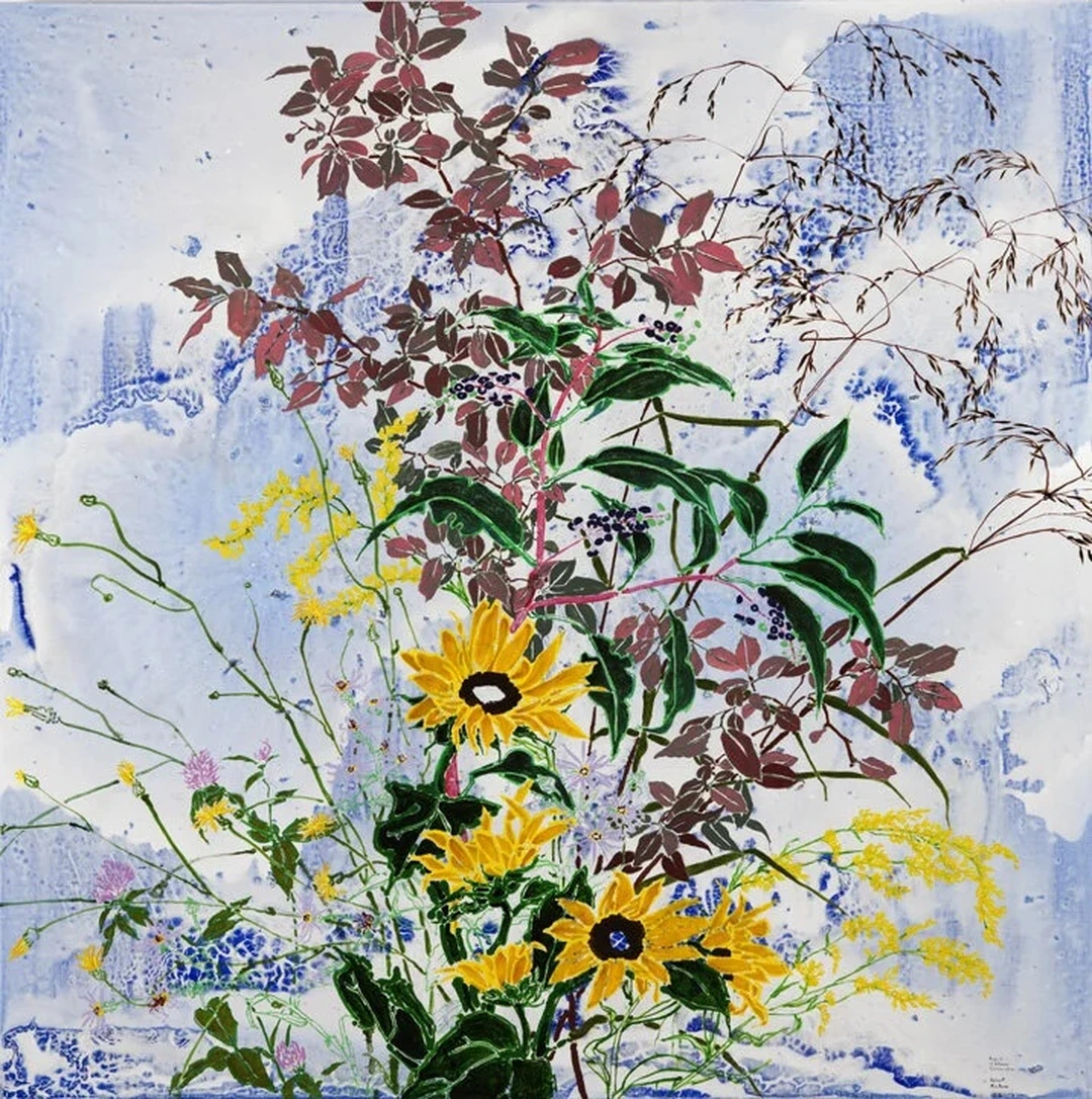
Before I get to Robert Kushner’s exhibition at the Solway Gallery, let’s take a look at the Pattern and Decoration (P&D) Movement1, which he helped found.
Ben Johnson’s curatorial notes for the 2012 exhibition “ReFocus: Art of the 70’s: Pattern and Decoration” at the Museum of Contemporary Art in Jacksonville, FL, sums up it concisely:
Pattern and Decoration also known as New Decoration, was comprised of a loosely associated group of artists who made paintings through the application of decorative patterns and techniques. The canvases, overflowing with flower motifs, and geometric shapes presented a new possibility in the world of 1970s painting – while the works were highly representational, each flower, heart, or shape distinct and recognizable, the works were non-hierarchical. Therefore, Painting and Decoration did not distinguish between background and foreground, nor did it emphasize specific aspects of the composition. Rather, much as the abstract paintings of the time, it covered the canvas from edge to edge in an all-encompassing design.2
Writer Holland Cotter saw the P&D artists as having:
distinctive styles but similar interests and experiences. All had had exposure to, if not immersion in, the liberation politics of the 1960s and early ’70s, notably feminism. . . . They were also acutely aware of the universe of cultures that lay beyond or beneath Euro-American horizons, and of the alternative models they offered for art. Varieties of art from Asia, Africa, and the Middle East, as well as folk traditions in the West, blurred distinctions between art and design, high and low, object and idea. They used abstract design as a primary form and ornament as an end in itself. They took beauty, whatever that meant, as a given.”3
As influences, Cotter identified quilts, wallpapers, printed fabrics, Art Deco glassware, Victorian valentines, Roman and Byzantine mosaics, Islamic tile work in Spain and North Africa, Turkish flower-covered embroideries, Iranian and Indian carpets and miniatures, and “Manhattan’s Lower East Side for knockoffs of these. Then they took everything back to their studios and made a new art from it.”4
The story of P&D began in the fall of 1974, when the painter Mario Yrisarry whose work included hard-edged geometric compositions, most notably color grids, chaired a panel in the Artists Talk on Art series (public discussions that occurred weekly in SoHo) called Pattern Painting.5
As Valerie Jaudon remembers, “The other artists on the panel were grid, color, geometrical, or hard-edge painters so there was a lot of talk about systems, modules, and mathematics as we met several times that fall to discuss the panel agenda.”6
In January 1975, a group7 including painters Miriam Schapiro, Tony Robbin, and Joyce Kozloff and critic Amy Goldin, who was studying Islamic art at the time and was looking to find a way to address and describe non-Western and decorative arts, met in Robert Zakanitch’s studio. Another gathering was held two weeks later and Goldin invited Kushner and Kim McConnel and the name Pattern and Decoration – “an unwieldy mouthful” according to Kozloff –was adopted.8
Kozloff says:
We each recall those days differently, but there were two powerful subjects that wove through our discussions: a rejection of current art modes and an excitement in the discovery of other forms.9 and 10
P&D supporters included Goldin as well as the writers Jeff Perrone, Carrie Rickey, Carter Ratcliff, April Kingsley, and John Perreault. The first Pattern and Decoration exhibition was at the Alessandra Gallery in 1976: “Approaches to the Decorative,” curated by Jane Kaufman. (Tony Alessandra would represent Kaufman as well as Schapiro and Tony Robbin, who later showed with Tibor de Nagy.) In 1977 Perreault organized a survey of Pattern Painting at P. S. 1.11
Other commercial galleries took on P&D artists, most notably Holly Solomon, who represented Kushner, Zakanitch, Jaudon, Ned Smythe, Kim MacConnel, and Brad Davis; Richard Kalina and Kozloff were part of the Tibor de Nagy stable; and Cynthia Carlson and Barbara Zucker were shown by Pam Adler.12
Despite this support, P&D was a difficult sell to many in the art world establishment as Kushner relates:
For gallery and museum acceptance, if the art was industrial-looking, rectangular, and gray, black, or white, it was shown . . . Everything else (except color field painting, which today can be viewed as Technicolor minimalism) seemed to be marginalized. This simply did not fit many of our [other P&D artists] temperaments. Gray was boring.”13
In an atmosphere where Minimalism and then neo-Expressionism, neo-Conceptualism in the late 1980s ruled, “no one knew what to make of hearts, Turkish flowers, wallpaper, and arabesques,” according to Cotter.14 And then there was what Cotter called “that beauty thing.”15 P&D was the dumb blonde in certain art circles.
Many of the women artists embraced feminism as a political agenda. By adopting traditional women’s work such as quilting and beading or using materials like lace and ribbons, they celebrated the anonymous contributions of women in the domestic arts. This didn’t endear P&D to critics and curators. As Cotter noted, “Art associated with feminism has always had a hostile press.”16
But by about 1985 “interest dried up,” writes Cotter. “Worse than that, in America the movement became an object of disdain and dismissal.”17
Now the art world has rethought Pattern and Decoration as recent exhibitions in Yonkers and Jacksonville attest.
Even though the P&D Movement lasted only about a decade, many of the artists associated with it have continued their aesthetic explorations in this direction, sometimes defiantly.
For Kushner although decorative has often been used to denigrate his work, he embraces it. “Decoration, an abjectly pejorative dismissal for many, is a very big, somewhat defiant declaration for me. An open acceptance of the Decorative leads me to places no other approach can.” 18
Donald Kuspit, reviewing Kushner’s 2007 exhibition at DC Moore, “On Location,” called him “arguably the most significant decorative artist working today.”
Lest that seem like a backhanded compliment, Kuspit opens the review with
The decorative has long had a bad name in modern art, yet it’s been there from the very beginning. “It can only do you good to be forced to decorate,” Gauguin wrote to his friend Daniel de Monfried in 1982, while in 1953, Clement Greenberg noted “how intense and profound sheer decoration, or what looks like sheer decoration can be.19
Now, finally, to Kushner’s show at Solway.
Kushner was born in 1949 in Pasadena, California, and received his B. A. from U. C. San Diego in 1971. Over the course of his career he’s been fascinated with kilim rugs (even working as a restorer when he first moved to New York), textiles and screens from Japan (a culture in which decorative is considered a term of high praise), Uzbek tribal embroideries, Chinese and Japanese painters. You can also see touches of Western artists such as Henri Matisse, Georgia O’Keeffe, and Pierre Bonnard in his work .
Kushner first gained art world attention for his costumes designed for his performances in the early 1970s. Some were quite skimpy, like the mushroom necklace and green-onion loincloth Kushner wore in Robert Kushner and Friends Eat Their Clothes Acme Production. This was presented at 98 Greene Street loft,20 the predecessor of P&D champion Holly Solomon’s SoHo gallery, which she and her husband, Horace, opened in 1975.21
In other performances Kushner draped painted fabrics over his body. Cotter describes the 1975 Visions Beyond the Pearly Curtain (for image see ) as being “shaped like a chador, cape, or kimono, although with its gathered swags and melon-orange curlicues it has the theatrical punch of a rococo opera curtain about to rise.”22
Given this background it’s perhaps logical that Kushner’s first paintings were figurative on draped canvases, but inspired by a 1985 trip to Japan, he turned his attention to flowers. Alexandra Anderson-Spivey in a review of his “On Location” exhibition wrote he decided “to rehabilitate the subject from its modern Western demotion to insipid fodder for amateur painters and hacks.”23 and 24. And flowers in all their glory continue to serve his aesthetic purpose.
In Kushner’s current exhibition at Solway’s, it makes sense to start with the earliest as well as the largest works: The Four Seasons, commissioned in 1990 for Tower Place mall. When the building was sold in 2012 to the city for $8.6 million (ironically from a parking fund given its future), they were removed. Fortunately Solway rescued them (Cincinnati seems to have a tradition of saving its art treasures, the prime example being the relocating of Union Terminal’s mosaics — twice) and hopes to find a new home or homes for them.
In early January 2014, Tower Place was acquired by Kingsley Wells Enterprises (former Bengals safety Chinedum Ndukwe is a principal). The plans call for 775 parking spaces and 8,500-square-feet of retail. The subhead on January 9, 2014, Enquirer cover story “New name, new purpose” tells it all: “Defunct Downtown mall becoming Mabley Place, garage with a few stores.”25
I don’t know how The Four Seasons were installed in their original location, but here they’re without context. They are just four very large paintings hung on white walls.
The quartet all follow the same compositional format: a triptych of three 9’ x 9’ panels. Anderson-Spivey has noted that the paintings in “On Location” demonstrate “Kushner’s impressive ability to sustain huge visual fields. The modular construction of Japanese screen led him to understand how to construct paintings that can exist either as separate panels or as a unified whole.”26
In each painting a parade of posies marches from left to right over broad bars of colors. There’s plenty of gold and silver leaf and mica powder with a few sequins scattered about and glitter used like another color in Kushner’s palette but it’s restrained glitz.
I know that the flowers are appropriately seasonal but since I am botanically challenged I don’t know. Otherwise assigning a season is somewhat difficult. For example, there’s nothing autumnal about the palette for Fall.
Installed in the Findlay Street Project Space, across the hall from the gallery proper and facing off against Spring, Winter comes closest to representing the season with its background of grays, white, watery blue, and silver leaf. There are only a few blooms but stems of spiky leaves meander across the three panels, starting in the far left canvas by clearly moving to the right, then stretching languorously across the middle panel before standing erect in the last.
In counterpoint to the majestic Four Seasons, there are wonderfully active paintings that stretch from 2009 (despite the exhibition title) to 2013. As a bonus, there are several prints, dated from 1995 to 2011.
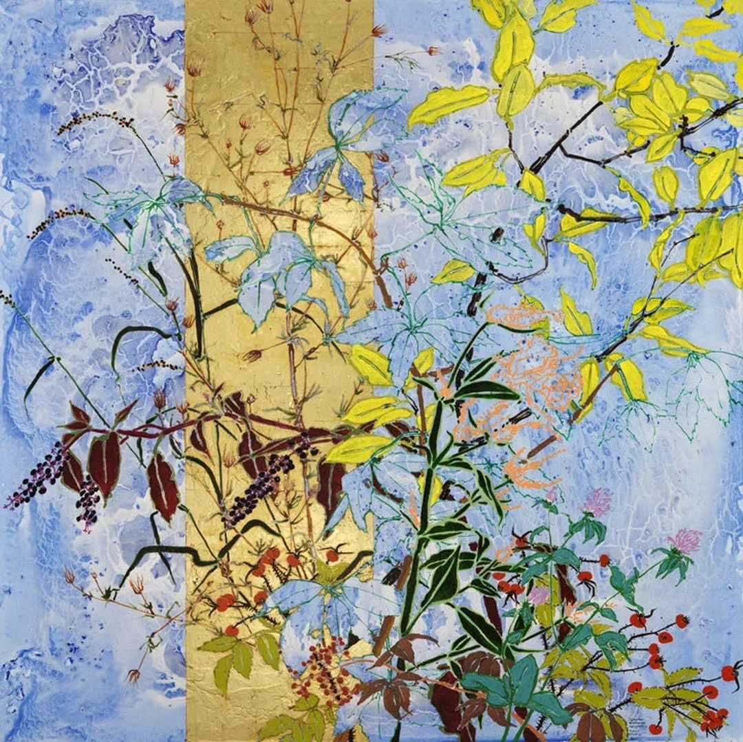
The paintings are all appealing, although I confess I found his Wildflower Convocations from 2010 less engaging, perhaps because the backgrounds are amorphous fields of watered down blue and don’t add much to the painting. Also the flowers themselves verge on becoming botanical illustrations.












Comments powered by Talkyard.