 Go to English Version
Carl Solway Gallery, 424 Findlay Street, Cincinnati
Milton Glaser, designer for all seasons, has turned his omni-talented hand to carpets, as can be seen in the glowing exhibition Milton Glaser: Drawings and Rugs at Carl Solway Gallery now through July 13.
“Glowing” is used advisedly, as the execution of Glaser’s designs, handmade in Nepal using a particular knotting technique known as the Tibetan style, incorporates Tibetan wool and fine silk, the silk imparting both shimmer and glow. In keeping with the designer’s own strong feelings toward conservation of our earth’s resources, Lapchi, the Portland, Oregon company which commissioned the designs, makes hand-woven, custom carpets “utilizing responsible business practices.”
There are fourteen rugs, all dated 2009-12, each ten feet by eight feet, shown on the walls and, in the case of two of them, on the floor ready to be walked on. Responsible gallery-goers at the opening mostly walked around them. When I went back to take a longer look for this article they still showed no foot prints.
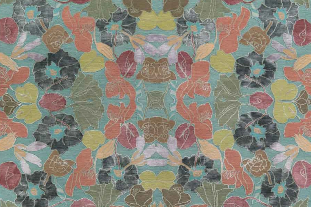
These designs can be executed in more than one set of colors, as seen in the brochure, but single examples are in the show. Each carpet is strikingly individual. “Best Flower” and “Paper Flower,” shown in the same gallery, make a nice contrast. The first is a vibrant take off from the frequent use of flowers for carpet design, the second a much airier suggestion of flowers that are a further step or two away from actuality. Another flowing pattern, “Stems,” does away with bloom to concentrate on the curve of stem and leaf. This latter pattern was inspired by Matisse’s cut paper artwork, the label tells us. I suspect that Matisse would be pleased. In a wholly different mood, “Monster” has a pattern that suggests animal stripes and is carried out in black on a tan background.
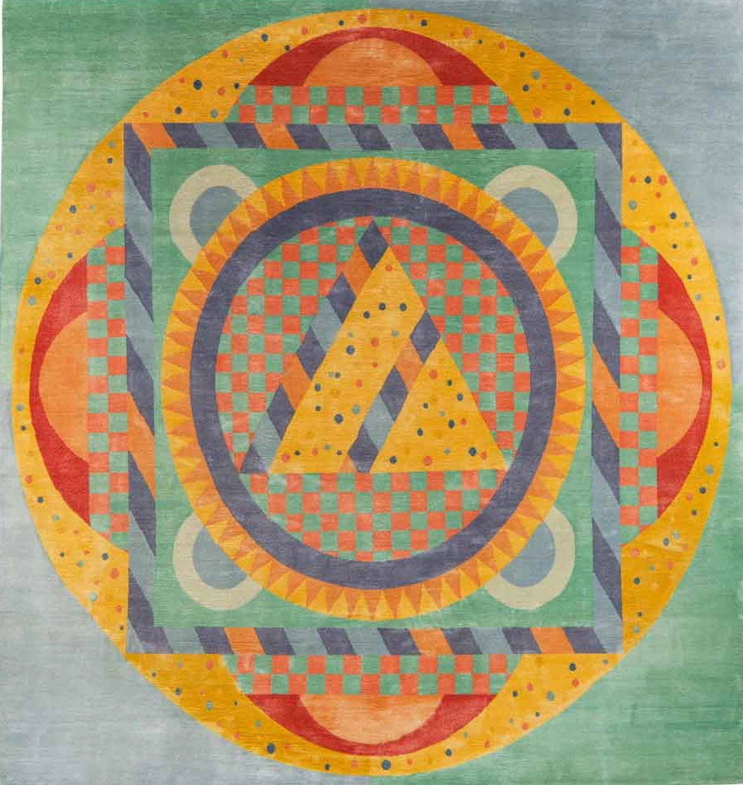
Hanging in the hallway but best viewed from the gallery opening to it is “Mandala Water,” a splendid amalgamation of symbolic shapes (circle, square, triangle) with yellows shading into orange and becoming red against a pale green background, the whole taking on depth and seemingly moving in and out if given the meditative attention this traditional design invokes.
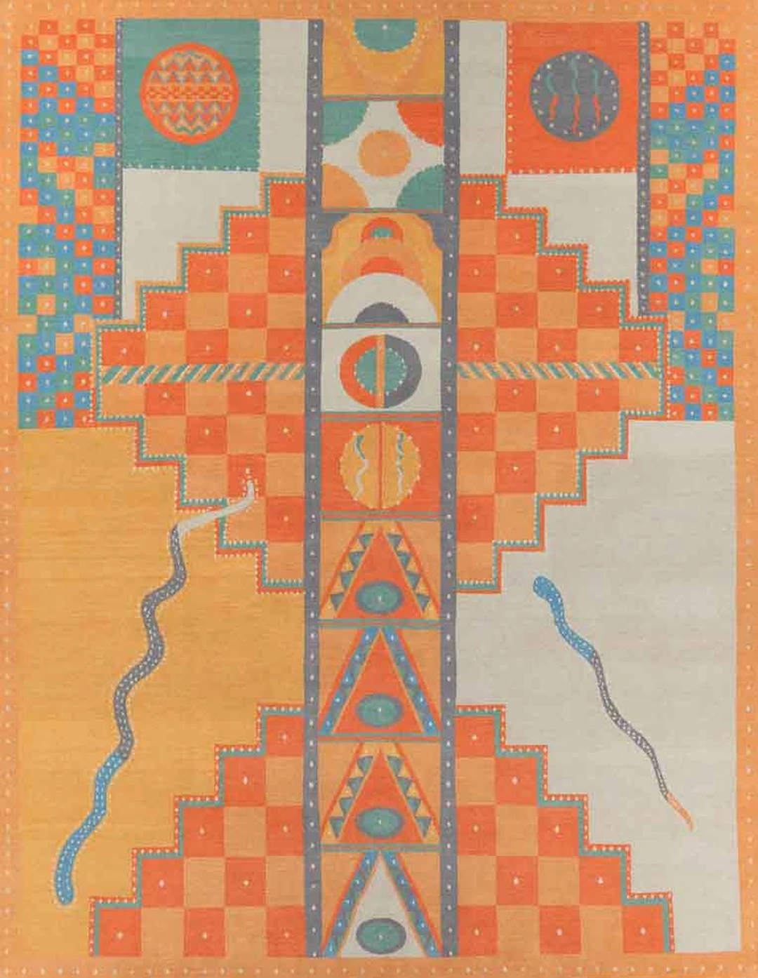
Also in the corridor is the carpet “Tantra,” accompanied by its preliminary drawing. The ideas are clear in the drawing but not everything is yet in place. There’s also a color screen print,”Light Tantra,” relating closely to the finished rug. Other prints hung in the hallway, almost all dated 2013, are often nicely paired. The first to be seen on entering is a complex composition of slim bars, each the same width, in darkish colors, everything so straight of line that curves might as well be outlawed. But of course they’re not, for hanging next to it is an array of flowers, ordered but luxuriant, the straight line dispensed with. Other pairs of prints share ideas but develop them in contrasting ways.
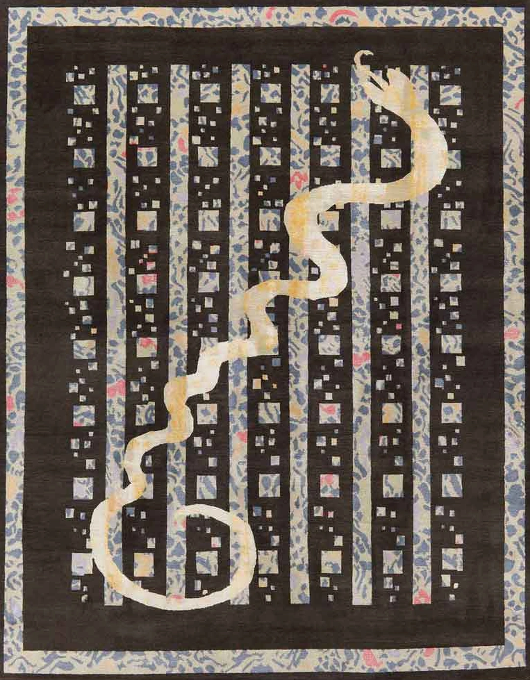
“Snake,” a formidable carpet hanging at the end of the corridor, is an ordered arrangement of squares and bars, bright colors on black background, interrupted by a sinuous length of pale snake from lower left to upper right corner. Like so many of these designs, “Snake” draws on Tibetan symbols, here the snake in its role as transforming agent.
Milton Glaser has been leaving his mark on our world for decades. He’s the man who put the heart in the I Love NY logo, his Bob Dylan posters are collectibles, he’s had solo exhibitions at MoMA and at the Centre Georges Pompidou in Paris. Born in 1929, he was taking life classes with the well known artists Moses and Raphael Soyer at age 13 and later attended New York City’s High School for Music and Art, then Cooper Union and in the early ’50s spent two years in Bologna, Italy, studying under Giorgio Morandi. Morandi, for whom still life was a calling that could never be too deeply explored, may have influenced Glaser’s repeated digressions on similar themes in his carpets and elsewhere as well as his allegiance to drawing as the source.
Happily, the second part of the exhibition centers on Glaser’s drawings. These are as early as the 1960s and as late as our current century and show us his long-standing obsession with the practice of art. “Centennial,” a screenprint from 1978, has sharp lines and firm colors. It hangs next to an undated color lithograph “Bathers at the Brera,” carried out in the gentlest of pastels within yielding lines.
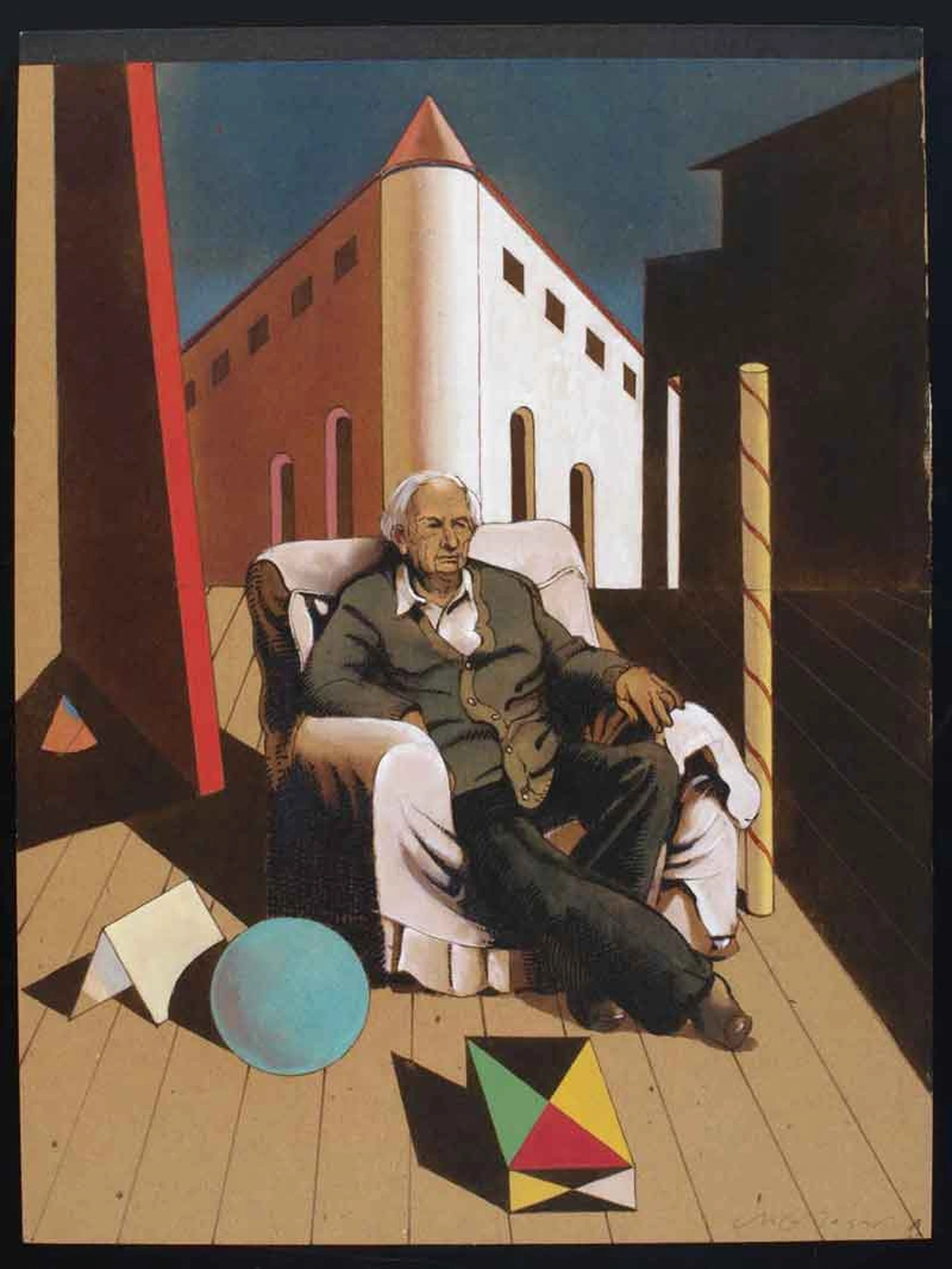
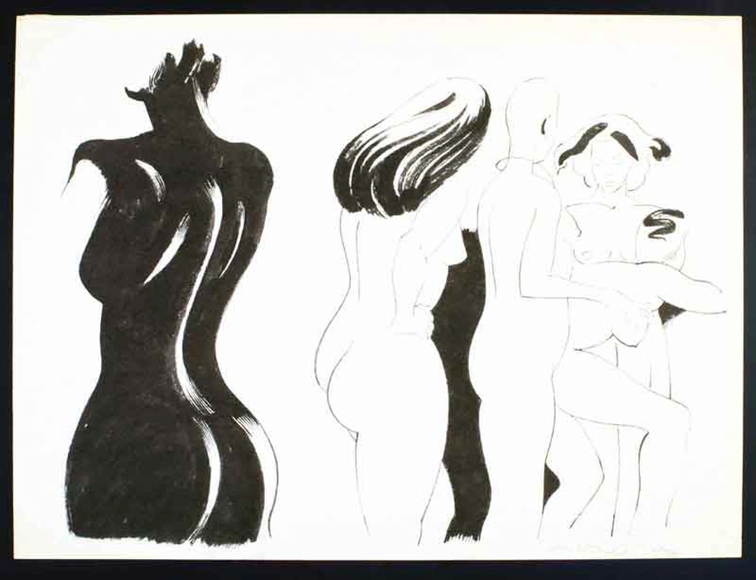
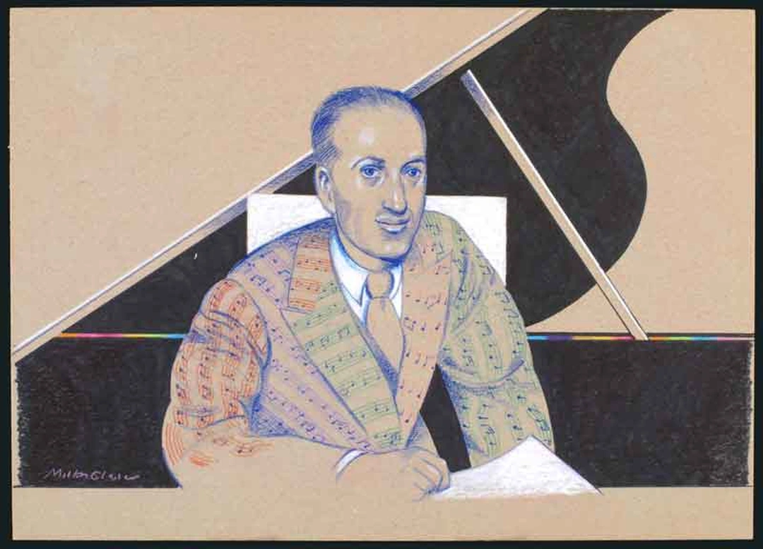
The study sketch for a 1994 book illustration (“Appollinaire” Vol III) is interestingly different from the finished watercolor just beside it; the figure there is animated and a small white cross, originally almost hidden, has moved to prominence. A group of works, dated 1991 to 2001, pays gentle tribute to artists Glaser admires: Claude Monet, Giorgio de Chirico, Toulouse Lautrec. The 1982 ink drawing aptly titled”Gestalt Nude Studies” glorifies the curve and the flesh that makes the curve. One wall is devoted to musicians. George Gershwin (1966), in a conventional pose beside a piano, seemingly wears a suit embroidered with bars of music. A pair (c. 1985) of colored pencil portraits of Bach present exactly the same pose but because of color choice the mood conveyed is strikingly different from one to the other. We also see the preliminary drawing and finished ink drawing of “Chopin and Bach for Tomato Records” (1989), with Bach at his instrument, intent, and Chopin, standing, equally intent in watching.
All of which suggests that Glaser has done his own watching of those who went before him. In turn, he has been watched by a generation or two of designers following him. But he’s hard to keep up with. Who would have expected him to turn to carpet design?
Also in the exhibition is a film interview with Glaser and friends and colleagues, discussing his career. In it he speaks of his home town, New York, in a way that makes clear he’s among those who love it. “You can study anything, learn anything here,” he says.
Solway’s accompanying exhibition features Terrie Hancock Mangat’s marvelously complex quilts, rich in references to the tradition from which they emerge but picked out by mixed media embellishments that dazzle the eye. The two shows are nicely compatible. In each the artistic impulse is prodigal but the artist’s control complete.













Comments powered by Talkyard.