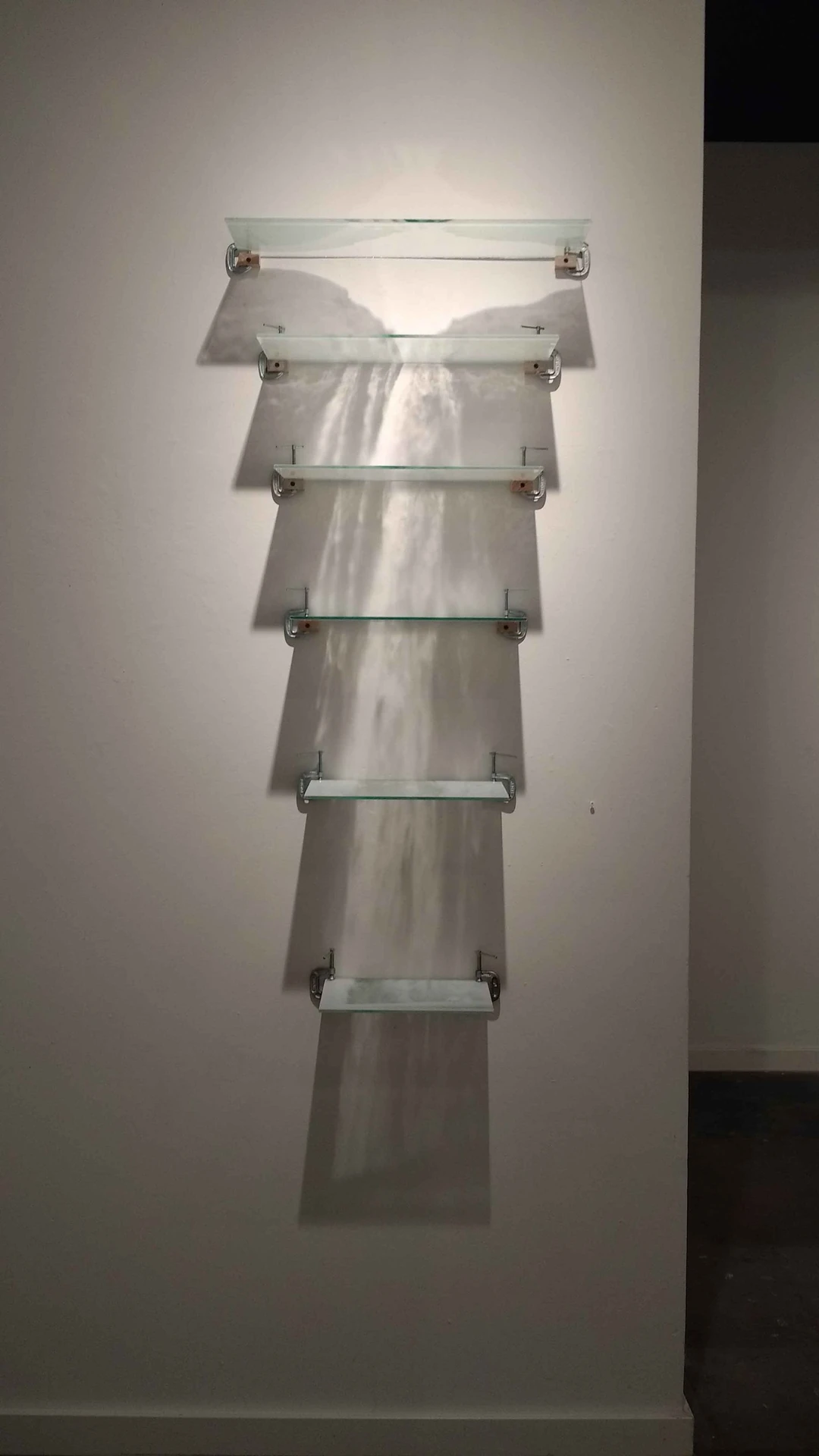
“This Waterfall is Falling for You” by Nicole Pietrantoni
Adults are often admonished for losing our appreciation for “play”; we find it childish, something we leave behind, and scientists often tell us that our brains are worse off for it. The two artists on display at Nicole Longnecker Gallery in Houston now encourage or suggest play in two different ways, and art collectors would be well-advised to check out this eclectic, sophisticated array of work.
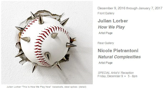
Screenshot from longneckergallery.com
It should be noted that only Julian Lorber’s work explicitly names “play”: his part, in the front gallery, is called “How We Play,” the centerpiece of spiked baseballs being called “How We Play Now.” Nicole Pietrantoni’s exhibition title is “Natural Complexities,” which, while not as explicit, is impossible to separate from the idea of play after you’ve got it in your head from the Lorber part.
I like that Pietrantoni’s show contains “complexities” in the title, because besides the presentation of these works, the simplicity is overwhelming. A creative flick of the wrist makes them come to life. For example, an otherwise unremarkable portrait of a waterfall transforms when screenprinted onto acrylic panels, chopped into horizontal pieces, and mounted perpendicular to the wall so their shadows cascade to the floor.
These shadow-play prints bring an ethereal quality to an otherwise playfully-colored show. The screenprinting process renders soft yet distinctive details in its shadows—much more than a close-up look at each panel. The effect is incredibly stylish, yet understated. The complexity of each natural phenomenon—waterfall, full moon, rainbow—is bold without intruding. Presenting each as ungraspable shadow is perhaps the most poetic way to showcase nature’s ghosts. Adding collage elements to each, easily lying on the flat panels, evokes that playful nature while maintaining a high level of sophistication. Who didn’t make shadow puppets as a child?
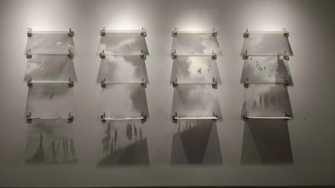
“Fixing the Sky” by Nicole Pietrantoni
I joked that Pietrantoni’s other work on display is a gallerist’s dream: easy to transport. The Kozo paper columns accordion-fold into “artist’s books.” The small touch of creating texture through the folds makes works like “Sunset Strips” truly pop. The larger books like “Cloven” and “Precipitous” bring a heightened sense of drama with their column-like presentation, like a red carpet leading up to the ceiling.
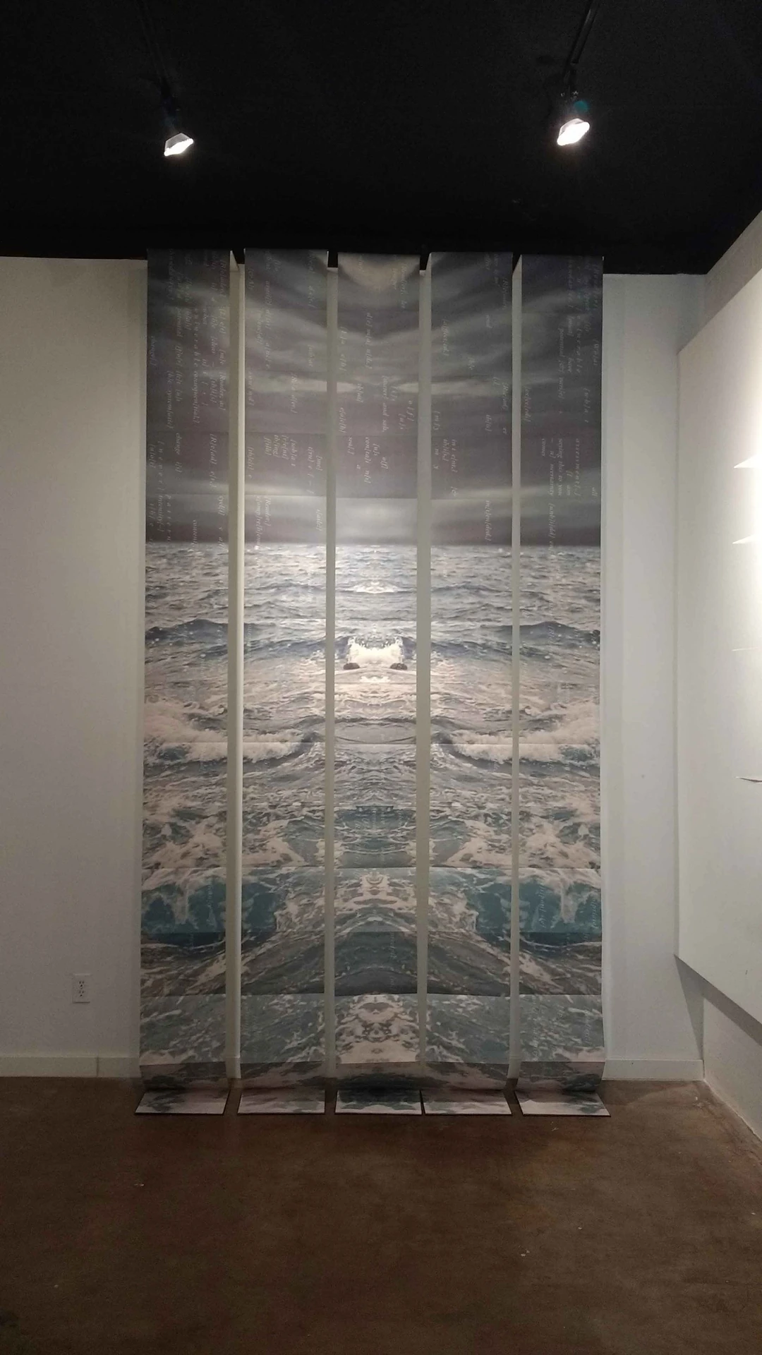
“Precipitous” by Nicole Pietrantoni
Julian Lorber’s spiked baseballs aren’t quite as dramatic in person as on the publicity pieces, but that’s only because the balls are in a somewhat neat stack instead of smashed into a plaster wall. A boon to the gallery walls, perhaps, but not quite capturing the potential energy of the piece.
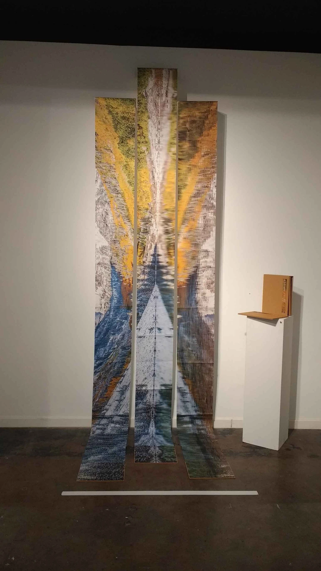
“Cloven,” with artist books, by Nicole Pietrantoni
As I mentioned, Lorber’s exhibition title is one word different than the piece itself: “How We Play Now,” playing on the wholesomeness of the American pastime. A decade or so ago, we might have interpreted the spikes as a subversive counterculture (goth, punk) muddying up the American dream, for better or for worse. But in the Trump era, it’s difficult to see it as anything other than a weapon against democracy: we will take what you love and enjoy and lob it back at you, with intent to harm. I imagine a rare U.S. factory cranking them out, a few “modifications” made overnight, and these dangerous orbs glutting out the next morning.
The only reason I can think of for the neat stack is so it will be easy to purchase them for $250 each. In a grittier exhibition, I imagine them smashed into walls around the other works. But I guess that’s one reason why I’m not a curator.
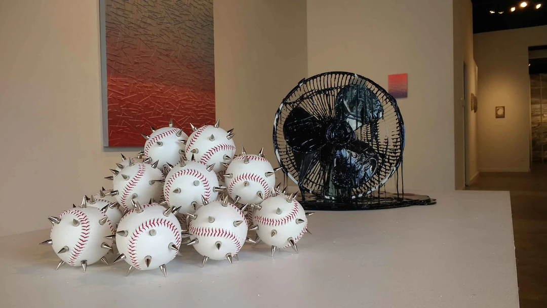
“How We Play Now” (foreground) and “Weeping Willow (2)” by Julian Lorber
I also enjoyed the conceit of the three oscillating fan pieces—the idea of what’s being circulated instead of pure, breathable air. “Weeping Willow (2)” looks straight out of an oil spill, and its play-on-nature title adds insult to malfunction. Still, one can imagine the fan turning on, spreading malfeasance through its humble design.
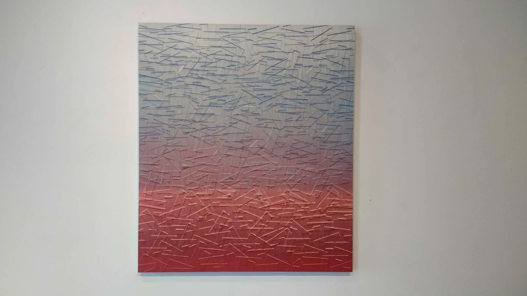
“Rainshadow” by Julian Lorber
The bulk of “How We Play,” though, consists of what I’ve been calling “band-aid” paintings. Varying in size and scope, Lorber uses both tape and molded resin to create texture on each panel. The acrylic paint isn’t part of the texture at all, and could almost be mistaken as spray paint on most pieces. I was tickled to see that one smaller print was called “Salt of the Earth,” and the idea of crystals enlarged to the point of rectangles and then sprayed neon was delightfully unnatural.
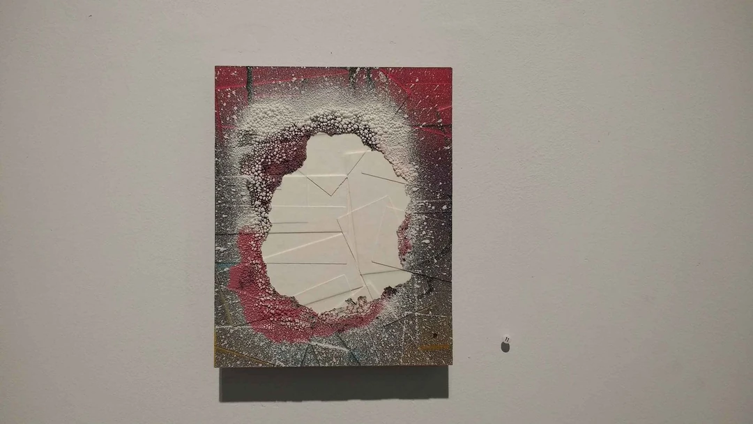
“Portal” by Julian Lorber
I’ve written before about my trouble with art shows in which all pieces are “untitled,” but suffered from the opposite problem with these pieces: title saturation. When every piece is essentially in the same style and medium, titles as varied as “Arrays” and “Somewhere It Hides A Well” and “Trading Moments for Memory” make it clear that they are more personal than communicable. At least one of my favorites, “Portal,” was straightforward, and “Foundation of Intention” is meaningfully sparse compared to its siblings.
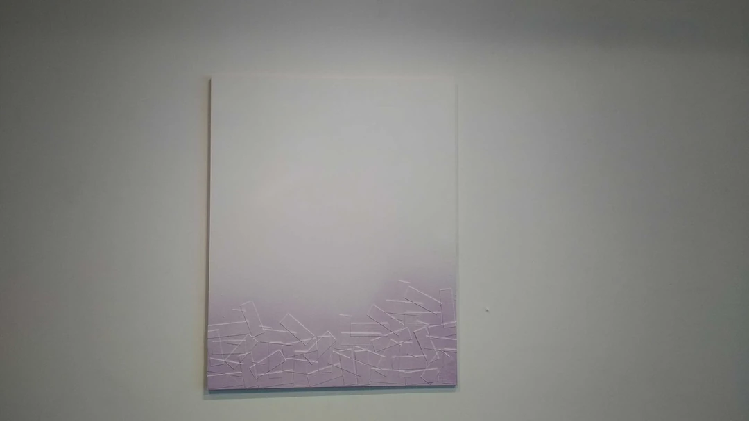
“Foundation of Intention” by Julian Lorber
“Foundation of Intention” is a bit of a joke on us as viewers (and reviewers), too: put art into our line of sight and watch us squirm out a meaning, unintended or not. Houstonians should make their own decisions: both exhibitions are up through January 7.